The Story Behind our Brand and the Logo
iLocal's Journey from Concept to IconIn branding, a logo is more than just a visual representation—it's a distillation of a company's ethos, values, and vision. The story behind iLocal's logo is one of creativity meeting purpose, of imagination intersecting with engineering, and of disparate elements coming together to form something greater than the sum of their parts.
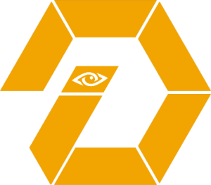
At the heart of iLocal's visual identity is the hexagon—a shape that embodies both form and function. Six lines, when connected, create this powerful geometric figure. It's a shape that speaks to the strength found in unity, the efficiency of design, and the pragmatic application of creative thinking.
The hexagon isn't just about aesthetics; it's a nod to the practical world. Think of a ratchet tool or a bolt head—their hexagonal shape allows for a stronger grip, more efficient force distribution, and greater resilience. This mirrors iLocal's approach: combining separate elements to create something robust, efficient, and enduring.
But iLocal's logo isn't a perfect hexagon. One hex segment tilts inward at the 7 o'clock position, breaking the symmetry. Atop this line sits a small rectangle housing an eye icon—a representation of the mind's eye, the seat of imagination and vision. This subtle deviation from perfection is intentional, symbolizing the balance between structured thinking and creative freedom.
The logo's animation brings this concept to life. Individual hexagons flow from left to right, transitioning from disorder to organized cohesion. It's a visual metaphor for the creative process itself—ideas start as scattered thoughts before coalescing into a unified vision. The final touch? One last hexagon joins the group, representing that moment when a brilliant afterthought completes the picture.
Notably, these animated hexagons come in two colors: white and gold. This choice is far from random. The white hexagons represent valid, foundational ideas, while the gold ones symbolize potential game-changers—diamonds in the rough. It's not about hierarchy or importance, but rather a representation of different thinking styles. The gold hexagons embody more out-of-the-box, boundary-free thinking, though their ultimate value remains to be determined. This dual-color approach speaks to the non-homogeneous nature of creativity, striking a balance between too much order (as a single color might suggest) and excessive chaos (which a multitude of colors could imply).
This visual narrative extends to iLocal's broader brand identity. The hexagon's six sides represent the six pillars of the iLocal Group: the business directory (iLocal), the internet radio station (iRadio), the e-gift card system (iCard), the crowdsourced voter's guide (iVote), the youth entrepreneurship program (iCreate), and the musician-focused platform (iMusic). Each element, while powerful on its own, gains exponential strength when united under the iLocal umbrella.
The "i" prefix in these brand names is no coincidence. It pays homage to Steve Jobs' iconic branding strategy. When he first introduced the iMac in 1998, he said the "i" was for internet. Our use of technology as the force multiplier carries on that tradition. He also said the "i" stood for inform, instruct, inspire, and individual. That is also part of the iLocal DNA, but our intellectual curiosity took things a step further. We found out that the symbol i stands for "imaginary unit," and it is extensively used in mathematics, specifically complex analysis. The number z=x+iy is thus a complex number being composed of a real part x and an imaginary part y. Imagination was not one of the original 'i" words but it is core to everything we do.
As Steve Jobs once said, "Creativity is just connecting things. When you ask creative people how they did something, they feel a little guilty because they didn't really do it, they just saw something. It seemed obvious to them after a while."
In this spirit, iLocal's branding connects the familiar "i" prefix with a state-specific focus, creating something that is both recognizable and uniquely Idaho. The last dot we connected was between the "i" in iLocal and the "eye" in the logo—inside the dot of the 'i" of the one segment of the hex. Thus, everything comes full circle. 
The iLocal logo and brand identity tell a story of creativity with purpose, of imagination tempered by practicality. It is a visual representation of the iLocal's mission to bring together Idaho's local businesses, creating a whole greater than the sum of its parts. In every line, shape, and animation, they embody the spirit of innovation, community, and local empowerment that drives iLocal forward.

